Merto Brand Guidelines
Everything the marketing and design team needs: logos, colours, typography, effects and component patterns. Use this as the single source of truth when creating assets for Figma, socials, print or web.
Last updated May 2026 · Merto Software Solutions
Logo Usage
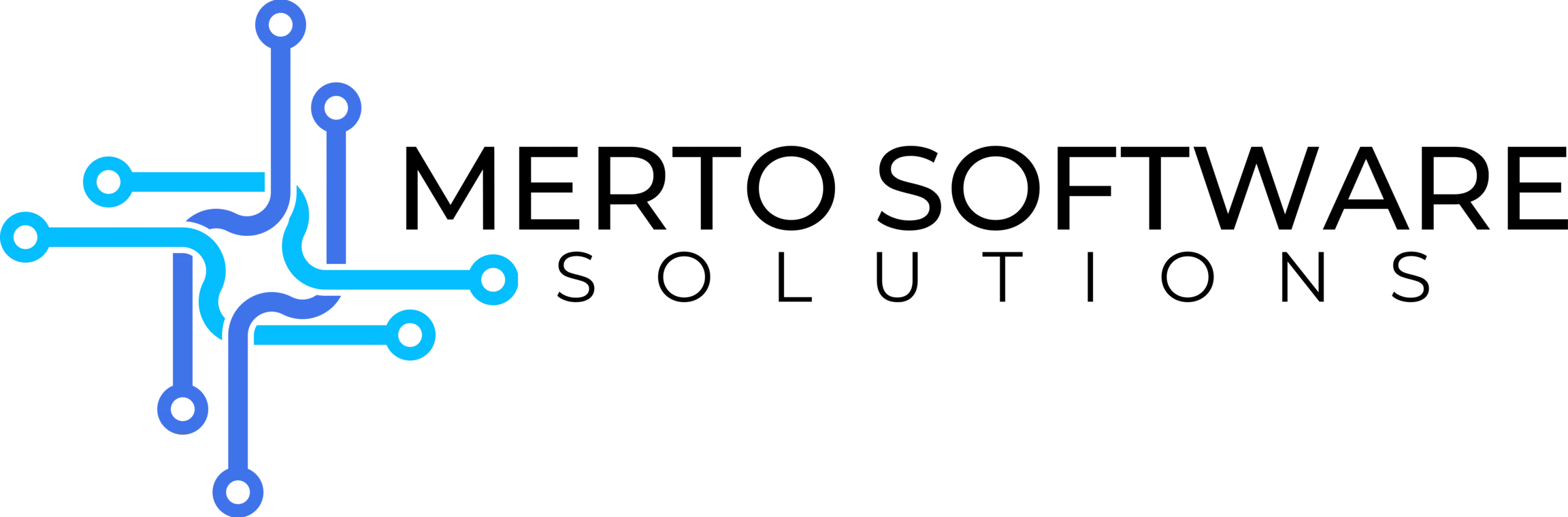
The Merto logo exists in three variants: on dark backgrounds, on light backgrounds, and an icon-only mark. Always use the correct variant for the context and maintain clear space equal to the height of the "M" letterform on all sides.

Dark Background
Use on dark or coloured backgrounds. Primary usage across the website.
Light Background
Use on white or light grey backgrounds. Ideal for print, documents and proposals.

Icon Mark
Use when space is limited, e.g. favicons, app icons, social media profile pictures.

Signature / Full Wordmark
For email signatures, PDF footers and formal documents where the full company name should appear beside the mark.
Logo don'ts
- Do not stretch or distort the logo
- Do not use the dark variant on a white background
- Do not apply drop shadows, outlines or effects
- Do not recreate, redraw or recolour the logo
- Do not place on busy photographic backgrounds without a solid container
- Do not use transparency on the logo itself
Colour Palette
The Merto palette is built around deep navy backgrounds, a signature blue accent, a supporting purple gradient, and carefully chosen text colours for legibility. All primary colours pass WCAG AA contrast on their intended backgrounds.
Primary Colours
New Blue / Cyan
#04BEFE RGB: 4, 190, 254
HSL: 196°, 98%, 51%
Hero glows, accent highlights, icon fills
Brand Blue
#5FA8F5 RGB: 95, 168, 245
HSL: 211°, 88%, 67%
Links, interactive text, CTAs on dark
Primary Blue
#1D4ED8 RGB: 29, 78, 216
HSL: 224°, 76%, 48%
Primary buttons, badges, tags on light bg
Secondary Purple
#5B4CDB RGB: 91, 76, 219
HSL: 246°, 63%, 58%
Gradient endpoints, accents, secondary CTAs
Light Purple
#7C6AF7 RGB: 124, 106, 247
HSL: 248°, 89%, 69%
Blob glows, gradient fills, decorative use
Lavender
#A394FF RGB: 163, 148, 255
HSL: 249°, 100%, 79%
Text gradients, heading accents
Background Colours
Footer Dark
#0C0D14 Primary dark background, footer, dark sections
Hero Dark
#0B0D12 Hero sections, full-bleed dark backgrounds
White
#FFFFFF Page background, light cards, print materials
Off-White
#F7F8FF Light section backgrounds, alternating rows
Text Colours
On Dark: Heading
#F0F0F8 On Dark: Body
#8889A8 On Dark: Muted Lighter
#B8B9DB Heading text
On Light: Heading
#0F172A Body and descriptive text on light backgrounds
On Light: Body
#475569 Supporting and footnote text on light bg
On Light: Muted
#6D6D6D Brand Gradients
Blue to Lavender
#5FA8F5 → #A394FF Primary heading accent gradient. Used on hero text highlights and emphasis spans.
linear-gradient(135deg, #5fa8f5, #a394ff)
Primary to Secondary
#1D4ED8 → #5B4CDB Light theme section gradients, card overlays and decorative backgrounds.
linear-gradient(135deg, #1d4ed8, #5b4cdb)
Dark Section Glow
Used behind CTA cards and hero sections. Two radial glows over the dark background.
Dual radial: #3b8be8 + #7c6af7 on #0c0d14
Light Section Glow
Soft ambient glow for light-background sections and hero variants.
Dual radial: #3b8be8 + #7c6af7 on #ffffff
Typography System
Two typefaces are used across all Merto materials. Sora leads with character and precision for headings; DM Sans carries everything else with clarity and warmth. Both are variable fonts available from Google Fonts and Fontsource.
Heading Font
Sora
Display / Hero — Bold 700 — clamp(2.5rem, 6vw, 4.5rem)
Build what your business actually needs.
H1 — Bold 700 — clamp(2.125rem, 5vw, 3.875rem)
Custom software, built in-house
H2 — Bold 700 — clamp(1.75rem, 3.5vw, 2.75rem)
Why businesses choose Merto
H3 — SemiBold 600 — 20px
API Integrations
300
Aa Bb Cc 123
400
Aa Bb Cc 123
500
Aa Bb Cc 123
600
Aa Bb Cc 123
700
Aa Bb Cc 123
800
Aa Bb Cc 123
Figma / Google Fonts
Search for Sora in Google Fonts
or install via npm: @fontsource-variable/sora
Weights in use: 300, 400, 500, 600, 700, 800 · Style: Normal only
Body Font
DM Sans
Body Large — Light 300 — 17px / line-height 1.8
We build custom software, API integrations, and AI automation for businesses tired of tools that slow them down. Based in the UK, serving businesses worldwide.
Body Regular — Regular 400 — 16px / line-height 1.75
Every week your team spends on workarounds is a week not spent growing. Our software development team connects your tools, automates manual work.
Body Small — Light 300 — 14px
Supporting copy, card descriptions, footnotes and secondary information. Used across sections where concise clarity is needed.
Label — Medium 500 — 12px / tracking 1.5px / uppercase
Software Solutions · API Integrations · AI Automation
300
Aa Bb Cc 123
Italic variant
400
Aa Bb Cc 123
Italic variant
500
Aa Bb Cc 123
Italic variant
600
Aa Bb Cc 123
Italic variant
700
Aa Bb Cc 123
Italic variant
Figma / Google Fonts
Search for DM Sans in Google
Fonts or install via npm: @fontsource-variable/dm-sans
Weights in use: 300, 400, 500, 600, 700 · Styles: Normal and Italic
Type Scale Reference for Figma
| Name | Font | Size | Weight | Line Height | Tracking |
|---|---|---|---|---|---|
| Display | Sora | clamp(2.5rem, 6vw, 4.5rem) | 700 | 1.10 | -2px |
| H1 | Sora | clamp(2.125rem, 5vw, 3.875rem) | 700 | 1.15 | -1.5px |
| H2 | Sora | clamp(1.75rem, 3.5vw, 2.75rem) | 700 | 1.15 | -0.8px |
| H3 | Sora | 20px | 700 | 1.3 | normal |
| Body LG | DM Sans | 17px | 300 | 1.80 | normal |
| Body | DM Sans | 16px | 400 | 1.75 | normal |
| Body SM | DM Sans | 15px | 300 | 1.70 | normal |
| Caption | DM Sans | 14px | 300 | 1.65 | normal |
| Label | DM Sans | 12px | 500 | 1.0 | 1.5px |
| Micro | DM Sans | 11px | 500 | 1.0 | 1.2px |
Visual Effects
Merto's visual language uses depth and light to create a premium, modern feel. These effects should be used consistently and sparingly to maintain impact.
Glassmorphism — Dark
Glass card on dark
Semi-transparent dark panel with backdrop blur, used for floating UI elements, demo cards and info panels.
bg: rgba(13, 14, 22, 0.85)
border: rgba(255, 255, 255, 0.10)
backdrop-filter: blur(8px)
shadow: 0 8px 40px rgba(0,0,0,0.35)
Glassmorphism — Light
Glass card on light
Frosted glass panel for light-background CTA cards, modal surfaces and elevated containers.
bg: rgba(255, 255, 255, 0.52)
border: rgba(255, 255, 255, 0.60)
backdrop-filter: saturate(1.4) blur(24px)
shadow: 0 8px 40px rgba(29,78,216,0.07)
Ambient Blob Glow
Blue blob: #04BEFE, opacity 0.20–0.25
Purple blob: #7c6af7, opacity 0.15–0.20
filter: blur(64px) (blur-3xl)
pointer-events: none; aria-hidden: true
Text Gradient
background: linear-gradient(135deg, #5fa8f5, #a394ff)
-webkit-background-clip: text
-webkit-text-fill-color: transparent
Use <em class="not-italic"> for semantics
Eyebrow / Badge Pill
border-radius: 9999px (rounded-full)
border: 1px rgba(59,139,232,0.25)
bg: rgba(59,139,232,0.12)
font: 12px / 500 / uppercase / tracking 1.5px
Subtle Glow Border Card
border: rgba(59, 139, 232, 0.18)
bg: rgba(59, 139, 232, 0.05)
border-radius: 16px (rounded-2xl)
UI Components
Reusable patterns used across the website. Replicate these in Figma by matching the exact colours, radius and spacing values noted below each example.
Buttons
On dark backgrounds
On light backgrounds
border-radius: 9999px · padding: 14px 28px · font: 15px / 500
transition: transform 200ms, box-shadow 200ms
hover: translateY(-2px) · active: scale(0.95)
Section Heading Pattern
Eyebrow pill → H2 heading → body description
Eyebrow: 12px / 500 / uppercase / tracking 1.5px
H2: Sora 700, clamp(1.75rem, 3.5vw, 2.75rem), tracking -0.8px
Body: DM Sans 300, 17px, leading 1.8, colour #8889a8
Feature / Info Cards
Feature title here
Supporting description that explains the feature concisely without overloading the reader with detail.
Second feature card
Each card carries an icon marker, a short Sora heading, and a DM Sans body. Border and bg are subtle overlays.
Card container: border rgba(255,255,255,0.06) · bg rgba(255,255,255,0.03) · radius 16px · padding 24px
Icon badge: h/w 40px · rounded-full · bg rgba(59,139,232,0.15) · colour #5fa8f5
Voice & Tone
Merto speaks like a trusted expert, not a salesperson. Confident without arrogance, clear without being cold. Always British English spelling and grammar.
We are
- Direct and honest: no fluff, no buzzword bingo
- Technically credible: we show understanding, not just confidence
- Human: we write for business owners, not procurement committees
- Problem-first: lead with the client's challenge, not our services
- Outcome-led: focus on what the client gains
- UK-English always: colour, organise, realise, optimise, specialise
We are not
- Overly formal or stiff: avoid corporate jargon
- Casual or slangy: maintain professionalism
- Hyperbolic: "world-class", "industry-leading" without proof
- Vague: "solutions" and "leverage" without meaning
- US English: no color, organize, realize, optimize
- Em dash users: use a comma, colon or full stop instead
Copy Examples
Avoid — Headline
Leverage world-class, industry-leading software solutions to optimize your business processes
Prefer — Headline
Stop losing time to systems that don't work together
Avoid — CTA
Get in touch to learn more about our range of services
Prefer — CTA
Book a free business assessment. No commitment required.
Avoid — Feature desc
Our cutting-edge AI-powered automation platform delivers ROI across your organization
Prefer — Feature desc
We automate the repetitive work so your team can focus on what actually grows the business
Merto Software Solutions Brand Guidelines · For internal and agency use · Last updated May 2026
Questions? Contact the marketing team before creating new brand assets.